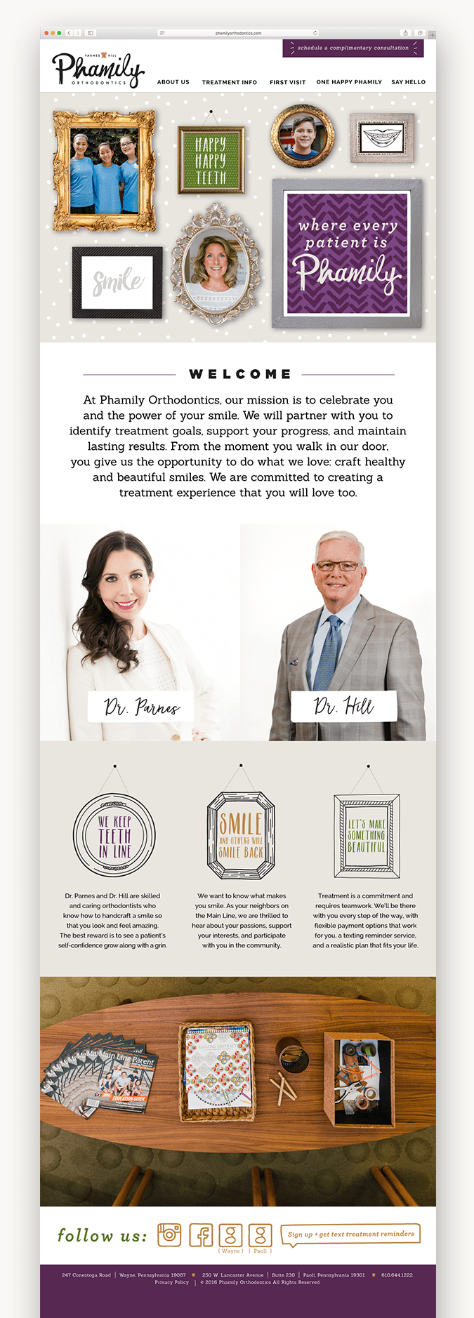
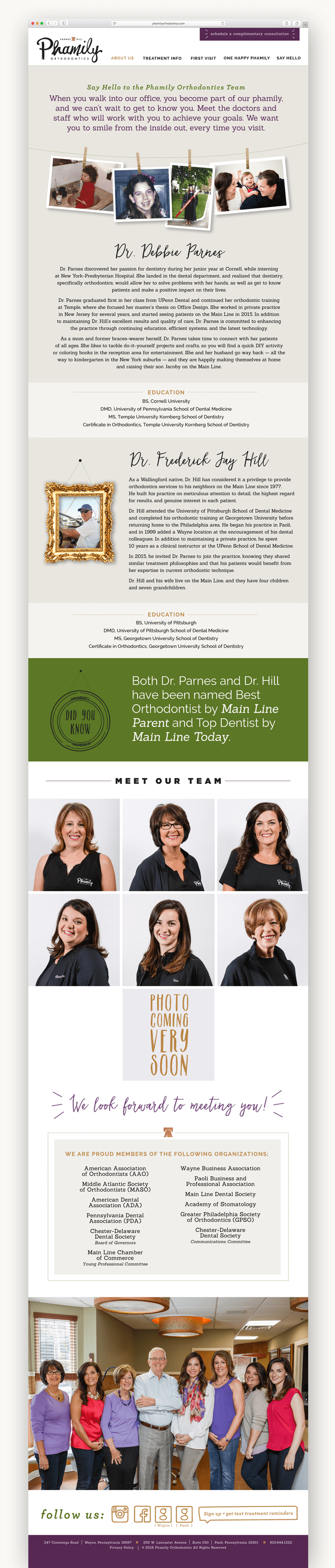
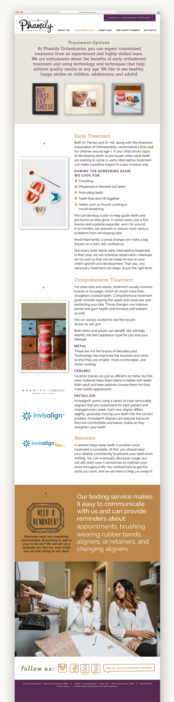
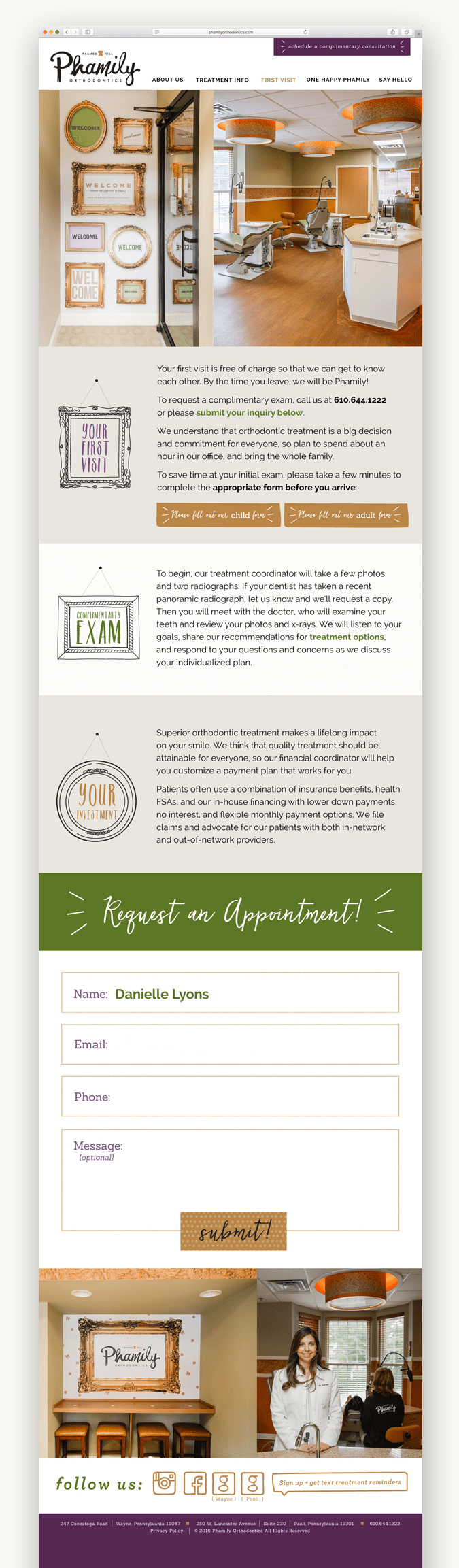
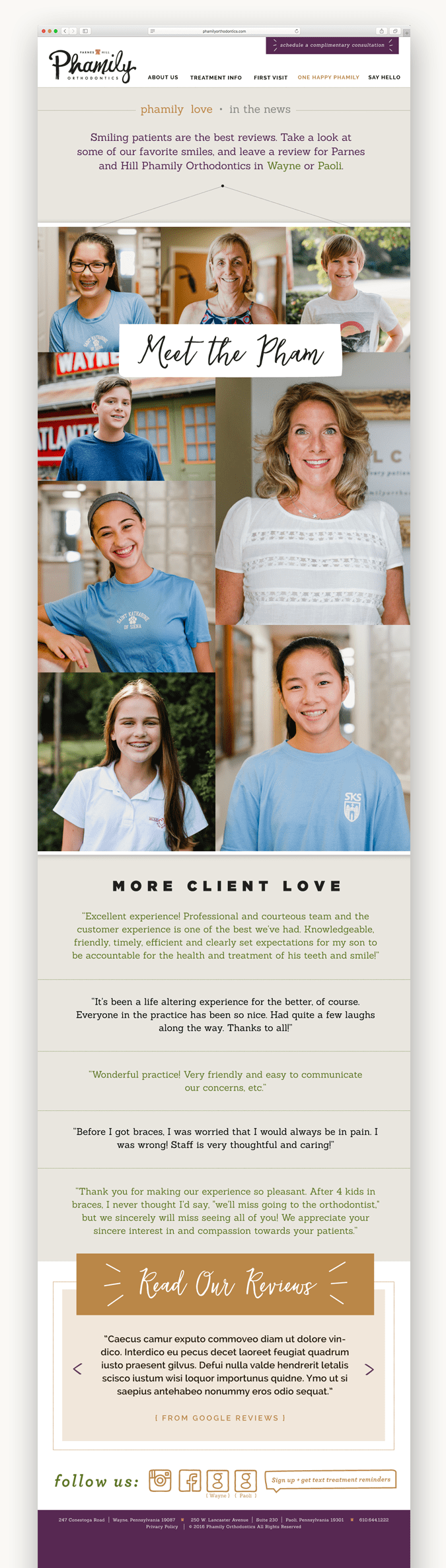
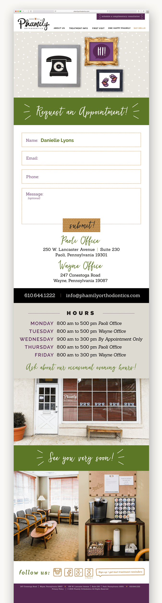
dr. debbie parnes, a former loveleigh bride, approached us as she was undergoing a rebrand for her practice, phamily orthodontics. once her new logo was completed she was in need of a new stationery package and website. debbie has an eye for color, type and design, which we learned when designing her wedding suite a few years back, so we knew this project was going to be a blast…even before our consultation! she requested a palette of bold purples and greens with a pop of gold. the entire design was inspired by a vintage ornate gold frame that represented phamily. from that iconic image, we designed an eclectic gallery wall filled with their phamily-patient photos which carried through the site. love me do photography shot brand new images of the staff and two beautiful offices, located in paoli and wayne, pennsylvania. we highly recommend dr. parnes and pham if you are searching for a new orthodontist. through the process, dee even got herself a brand new gold glitter retainer!
work wednesday: phamily orthodontics website.

Recent Comments